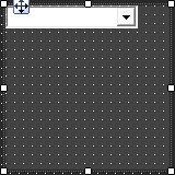
The Device Frame looks and behaves similar to a standard Panel. Like a standard Panel, Parameter controls are added into it. Unlike a standard Panel, it has the power to change which Parameters its controls are attached to at run time (as opposed to design time).
At the top of the Design Frame is a combo box which lists devices of the same type. When the Device Frame is running, you can change which device is currently selected. All the controls in the Device Frame should then switch Parameters moving to corresponding State Variables on the newly selected device. In this way, you can create one small control panel which potentially controls or monitors any number of devices.
|
|
OPTIONS / INSTRUCTIONS |
NOTES / EXAMPLE |
General |
||
|
Control Info |
The control type |
Read only |
Appearance |
||
|
Location |
Control location (in pixels) of the control on the Custom Panel Change X (horizontal) and Y (vertical) values in relation to upper left corner You can also drag the control to a different location |
|
|
Size |
Control size (in pixels) Change width and height values You can also re-size the control manually |
|
|
Paint Style |
The type of background fill |
Select from Solid Brush or Gradient Brush |
|
Gradient Mode |
The direction that a color gradient fill will flow |
Select from Horizontal, Vertical, Forward Diagonal or Backward Diagonal |
|
Background Color |
The background color when in Solid Brush style Brings up the Select Color window |
|
|
Gradient Color Start |
The starting color of a gradient fill Brings up the Select Color window |
|
|
Gradient Color End |
The ending color of a gradient fill. Not used for a solid fill Brings up the Select Color window |
|
|
Background Image |
Selects a background image for the panel. Brings up the Select Image File window |
|
|
Background Image Layout |
The way the background image is drawn |
Select from None, Tile, Center, Stretch or Zoom |
|
Border Style |
The style of the Panel border |
Select from drop down list |
|
Draw Border |
When checked, a border is drawn around the Panel |
|
|
Rounded Corners |
When checked the corners of the box will be rounded by the Corner Radius amount |
|
|
Corner Radius |
The radius of the corners |
|
|
Tab Index |
If tab stop is set to true, determines the position of the control in the tab order |
|
|
Tab Stop |
Specifies whether the control appears in the tab order |
Checked = Appears Unchecked = Won't appear |
Combo Box |
||
|
Horizontal Alignment |
The alignment of the Combo Box within the Device Frame |
Select from Left, Center or Right |
|
Devices |
Brings up a Devices select window where you will select the available devices to assign to the Device Frame |
|