|
|
OPTIONS / INSTRUCTIONS |
NOTES / EXAMPLE |
General |
||
|
Control Info |
The control type |
Read only |
|
Graph Name |
The name of the graph |
Required to link to a Selector Panel or Widget Panel. |
|
Channel Selector Name |
The name of the Selector Panel that the graph is linked to |
|
|
Locked |
Specifies if the control is locked out so that it cannot be moved or re-sized |
Checked = Locked Unchecked = Unlocked
|
|
Widget Panel Name |
The name of the Widget Panel that the graph is linked to |
|
Parameters |
||
|
Addresses |
Edit Device, Object and Parameter addresses |
|
|
Override attach alert |
Whether to display the warning for disconnected controls |
Checked = Display Unchecked = No Display |
Appearance |
||
|
Location |
Control location (in pixels) of the control on the Custom Panel Change X (horizontal) and Y (vertical) values in relation to upper left corner You can also drag the control to a different location |
|
|
Size |
Control size (in pixels) Change width and height values You can also re-size the control manually |
|
|
Show Grid |
Whether or not to display the grid lines |
Checked= Display Unchecked = No Display |
|
Axis Color |
The color of the grid axis Brings up the Select Color window |
|
|
Axis Label Color |
The color of the grid axis label Brings up the Select Color window |
|
|
Font |
Font for tick labels Click on "..." to select desired font |
Selects from Windows fonts |
|
Axis Font |
The font for Input (dB) and Output (dB) labels |
Selects from Windows fonts |
|
Value Format |
The format of the values next to the major tick marks |
0.## means whole number with two decimal places |
|
Margin Width |
The width of the margin from the sides to the graph (in pixels) |
|
|
Margin Height |
The height of the margin from the sides to the graph (in pixels) |
|
|
Background Color |
Background color of the graph Brings up the Select Color window |
|
|
Enable Graph Label |
Whether to display the graph label |
Checked = Display Unchecked = No Display |
|
Enable Labels |
Whether to display the graph axis labels |
Checked = Display Unchecked = No Display |
|
Grid Color |
Grid line color Brings up the Select Color window |
|
|
Tick Color |
Color of the tick marks Brings up the Select Color window |
|
|
Control Point Color |
Color of the control points Brings up the Select Color window |
|
|
Input Grid Spacing |
Spacing (in dB) between vertical grid lines |
|
|
Input Tick Spacing |
Spacing (in dB) between vertical tick marks |
|
|
Output Grid Spacing |
Spacing (in dB) between horizontal grid lines |
|
|
Output Tick Spacing |
Spacing (in dB) between horizontal tick marks |
|
|
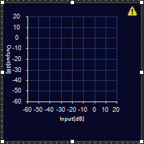
Min Input |
Minimum input level (in dB) shown on the graph |
|
|
Max Input |
Maximum input level (in dB) shown on the graph |
|
|
Min Output |
Minimum output level (in dB) shown on the graph |
|
|
Max Output |
Maximum output level (in dB) shown on the graph |
|
|
Tool Tip Text |
The text that appears on control mouse over |
|
|
Tab Index |
If tab stop is set to true, determines the position of the control in the tab order |
|
|
Tab Stop |
Specifies whether the control appears in the tab order |
Checked = Appear Unchecked = Doesn't Appear |
Graph |
||
|
Channel Visibility |
How many channels should be visible |
Single Visible or All Visible |
Channel |
||
|
Selected Channel |
Sets the selected channel |
|
|
Channel Color |
The color of the channel line Brings up the Select Color window |
|
|
Channel Guide Lines |
Whether or not to display channel guide lines |
Checked = Display Unchecked = No Display |
|
Channel Guide Line Color |
The color of the channel guide lines Brings up the Select Color window |
|
Control Point |
||
|
Diameter |
Diameter for control points (nubs) on an un-selected channel |
|
|
Selected Diameter |
Diameter for control points (nubs) on a selected channel |
|
|
Draw When |
When control points (nubs) are drawn |
Selected, Never, Active or Always |
|
Draw Which |
Which control points (nubs) should be drawn |
All, None, Primary or Secondary |
|
Primary Style |
Style of the parametric primary control points (nubs) |
Circle, Square, Diamond or Pointer
|