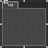
A tab panel is a box with selectable tabs that allows you to manage the look of your Custom Panel as well as group controls together in a functional, attractive manner.
Tab panels can be managed in the Custom Panel designers and, once the Custom Panel is activated, viewed by the end user. They can also select the desired tab.
Add a Tab Panel by dragging and dropping the Tab Panel icon, then add controls to the panel the same way you would a Custom Panel.
After the tab panel has been added, add controls to the tab panel the same way you would a Custom Panel. If the controls are not on the tab panel, select them and drag them over to the panel. There are two levels to the panel - the entire panel and the tab portion of the panel.
|
|
OPTIONS / INSTRUCTIONS |
NOTES / EXAMPLE |
Appearance |
||
|
Border Style |
The style of the Panel border |
Select from drop down list |
|
Background Color |
The background color behind the Tab Brings up the Select Color window |
|
|
Tab Background Color |
The background color of the tab area Brings up the Select Color window |
|
|
Tab Foreground Color |
The color of the Tab's text Brings up the Select Color window |
Select from Solid Brush or Gradient Brush |
|
Text |
The header text for this tab |
|
|
Font |
Click on "..." to select desired font. Brings up a Font Select window |
Selects from Windows fonts |
|
Background Image |
Selects a background image for the panel. Brings up the Select Image File window |
|
|
Background Image Layout |
The way the background image is drawn |
Select from None, Tile, Center, Stretch or Zoom |
|
Text Padding |
The amount of space around the text for this tab page |
|
Design |
||
|
Draw Grid |
When checked, the positioning grid will be drawn |
|
|
Grid Size |
Adjusts the size of the grid points within the panel. 8,8 is the default. Making this number smaller, such as 6,6 will add more grid points. |
|
|
Snap To Grid |
Snaps each element in the Panel to the nearest grid point. |
|