A selector panel is a control that can link to a graph. It has buttons that allow the control panel user to select channels or bands on the graph.
Once the Selector Panel is tied to a graph, you can change its properties, including whether it will select bands or channels on the graph. To select the panel for editing, click anywhere between its borders and the buttons on the panel:
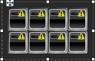
Individual selector buttons may be edited as well.
NOTE: Graphs can be managed in the Custom Panel designer and, once the Custom Panel is activated, utilized by the end user.
NOTE: Overlapping controls, especially graph controls, can result in unexpected behavior and/or appearance of controls. Use caution if you choose to overlap controls.
|
|
OPTIONS / INSTRUCTIONS |
NOTES / EXAMPLE |
General |
|
|
|
Control Info |
Shows control type |
Read only |
|
Selector Panel Name |
The name of the selector panel |
Used for graph collaboration |
|
Graph Name |
The name of the graph that the selector panel is tied to |
|
Appearance |
||
|
Location |
Control location (in pixels) of the control on the Custom Panel Change X (horizontal) and Y (vertical) values in relation to upper left corner You can also drag the control to a different location |
|
|
Size |
Control size (in pixels) Change width and height values You can also re-size the control manually |
|
|
Paint Style |
Background paint style of the control SolidBrush - solid background GradientBrush - gradient fill background |
|
|
Gradient Mode |
Type of gradient fill if gradient is selected in Paint Style Click to select type of gradient: |
|
|
Background Color |
Color of the background Brings up the Select Color window |
Default color is black |
|
Gradient Color Start |
Beginning gradient color if gradient is selected in Paint Style Brings up the Select Color window |
|
|
Gradient Color End |
Ending gradient color if gradient is selected in Paint Style Brings up the Select Color window |
|
|
Background Image |
Background graphic of control Brings up the Select Image File window |
|
|
Background Image Layout |
How the background image displays |
How the image is displayed None (default layout - upper left corner) Tile, Center, Stretch or Zoom |
|
Border Style |
Click to select border style |
|
|
Draw Border |
Whether or not the control has a border |
Checked = Border Unchecked = No Border |
|
Rounded Corners |
Whether or not to round the corners |
Checked = Rounded Unchecked = Not Rounded |
|
Corner Radius |
The radius of the corners |
The larger the number, the larger the curve |
|
Tab Index |
If tab stop is set to true, determines the position of the control in the tab order |
|
|
Tab Stop |
Specifies whether the control appears in the tab order |
Checked = Appear Unchecked = Doesn't Appear |
Button |
||
|
Display LED Button |
Whether to use an LED button or a plain button to select the correct channel or band |
Checked = Yes (LED On Image/Off Image on selector Button properties) Unchecked = No (Button Selected/Unselected Images on selector button properties) |
|
Font |
Font style for the text on the control Click on "..." to select desired font |
Selects from Windows fonts |
Selector |
||
|
Button Configuration |
The number of buttons across and down |
Select from drop down list |
|
Selector Type |
Whether the buttons will select a channel or a band |
|
|
Margin |
The margin around the outside of the buttons |
|